This article explains Android app screen size, why it’s important, and how developers can deal with different sizes and resolutions.
Understanding Android Screen Resolutions and Sizes
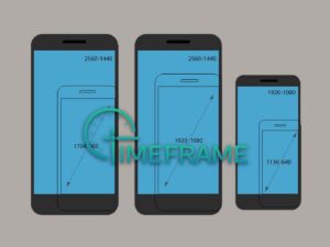
Android devices come in various sizes and resolutions. It’s important for developers to understand these differences to make sure their apps work well on all devices.
Importance Of Screen Resolutions
Screen resolutions affects how things look on a screen. Android app screen size refers to how big an Android app screen is and how many pixels it has.
More pixels mean sharper images and clearer graphics. Developers need to know about different screen resolutions to make sure their apps look good on all devices.
How It Affects App Design
Screen size directly impacts how developers design their apps. They need to make sure their Android app screen size looks good.
Using a responsive design approach helps the app adjust to different screens, making it easier for users to use the app no matter what device they’re using.
Besides resolution, developers need to consider other factors like aspect ratio and pixel density. Aspect ratio is the ratio of a screen’s width to its height, which can vary across devices.
Pixel density, measured in pixels per inch (PPI), affects how sharp images look. Developers need to think about these things to make sure their Android app screen size look consistent on all devices.
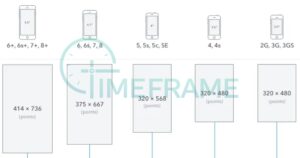
Examples of Different Android Screen Sizes
Android phones come in many sizes, which can make it hard for app makers to create apps that look good on all of them. We’ll list different Android screen sizes by showing various Android screen resolutions.
- 360×800 (8.56%): This size is common on phones with 5-inch screens, which are a good mix of being big enough but still easy to carry.
- 414×896 (6.95%): Found on phones with slightly bigger screens, around 5.5 to 6 inches, giving more space for stuff on the screen.
- 360×640 (6.45%): Seen on cheaper phones with smaller screens, giving basic functions and okay picture quality.
- 412×915 (4.77%): Used on mid-range phones with bigger screens, offering a good mix of screen size and picture quality.
- 390×844 (4.75%): Found on phones with taller screens, like with a 19.5:9 aspect ratio, giving a more immersive viewing experience.
- 360×780 (4.56%): Found on phones with taller screens, giving more space for stuff on the screen and a modern look.
- 375×667 (4.43%): This size is common on phones with 4.7-inch screens, making them small and easy to hold.
- 375×812 (4.35%): Seen on phones with a notch or cutout at the top, giving more screen space to use.
- 360×760 (3.84%): Found on phones with taller screens, giving more space for stuff on the screen and easy to use.
- 393×851 (3.56%): Used on phones with 5.5-inch screens, offering a good mix of screen size and picture quality.
- 393×873 (3.13%): Found on phones with taller screens, giving more space for stuff on the screen and easy to use.
- 412×892 (2.74%): Used on mid-range phones with bigger screens, offering a good mix of screen size and picture quality.
- 428×926 (2.4%): Found on phones with taller screens, giving more space for stuff on the screen and easy to use.
- 360×720 (2.23%): Seen on cheaper phones with smaller screens, giving basic functions and okay picture quality.
- 385×854 (2.14%): This size is common on phones with 4.8-inch screens, making them small and easy to hold.
- 412×869 (2.14%): Found on mid-range phones with bigger screens, offering a good mix of screen size and picture quality.
- 414×736 (1.94%): Used on phones with 5.5-inch screens, offering a good mix of being big enough but still easy to carry.
- 412×846 (1.78%): Found on mid-range phones with bigger screens, offering a good mix of screen size and picture quality.
- 360×740 (1.64%): This size is common on phones with 4.7-inch screens, making them small and easy to hold.
- 384×854 (1.3%): Seen on cheaper phones with smaller screens, giving basic functions and okay picture quality.
It’s important for app makers to think about these different screen sizes when they design their apps.
By understanding the different sizes, app makers can make sure their apps look good and work well on lots of different phones.
By considering different screen resolutions and using responsive design principles, developers can make sure their apps look great on all devices.
Testing and making adjustments are essential steps to ensure a smooth user experience no matter what device is being used.
By focusing on screen resolutions, developers can create apps that are visually appealing and functional on a wide range of Android devices.
See Also: Android App Development: 10 Steps To Create a User Friendly Android App
4 Ways For Android App Screen Size Optimization
When you’re building an app for Android, it’s important to make sure it looks good on all kinds of devices. Some devices have big screens, some have small screens, and some have screens that are somewhere in between.
Let’s look at some strategies you can use to make sure your Android app screen size looks great.
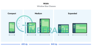
Screens on Android devices come in all shapes and sizes. Some are tall and skinny, while others are short and wide. The size of a screen is usually measured in inches, and the resolution is measured in pixels.
1. Using Flexible Layouts
One way to make your Android app screen size look good is to use a flexible layout. This means designing your app so that it can adjust to different screen sizes.
You can do this by using something called a “constraint layout.” This type of layout lets you set rules for how different parts of your app should be positioned relative to each other.
For example, you can say that a button should always be at least 20% of the screen width away from the edge of the screen. This way, the button will always be in the right place, no matter how big or small the screen is.
2. Making Images and Icons Scalable
Images and icons are an important part of any app, but they can be tricky to get right on different screens. One way to solve this problem is to use vector graphics for icons.
Vector graphics are like digital drawings that can be resized without losing quality. This means that your icons will look sharp and clear no matter how big or small they are.
For other images, you can use formats like SVG or WebP, which are also scalable and can adapt to different screen sizes.
3. Testing Your App on Different Devices
Once you’ve designed your app, it’s important to test it on different devices to make sure your Android app screen size looks good everywhere.
You can use a tool called an “emulator” to simulate different screen sizes, but it’s also a good idea to test your app on real devices if you can. This way, you can see exactly how your app looks and feels on different screens.
4. Accessibility
Accessibility is another important factor to consider when designing your app. This means making sure that your app is easy to use for people with disabilities.
For example, you should use text sizes that are easy to read and colors that have enough contrast. This can make a big difference for users who might have trouble seeing or reading small text.
Designing an app that looks good on all Android screens can be challenging, but it’s an important part of creating a successful app.
By using flexible layouts, scalable images, and testing on different devices, you can ensure that your Android app screen size looks great no matter where it’s used.
Accessibility is also key, so make sure to consider the needs of all users when designing your app. By following these strategies, you can create an app that provides a great user experience for everyone.
See Also: 5 Categories Of Cool Android Mobile Apps You Must Have On Your Smartphone
Android App Screen Size Optimization With Tools
There are several tools available to help you optimize your Android app screen size. These tools can simplify the process and ensure that your Android app looks great on any device.
1. Android Studio
Android Studio is the official IDE for Android app development. It includes tools like the Layout Editor, which allows you to preview your app’s layout on different screen sizes.
This can help you identify and fix issues related to screen size optimization. Android Studio also offers virtual devices with different screen sizes, allowing you to test your app on a variety of devices.
2. Firebase Test Lab
Firebase Test Lab is a cloud-based testing infrastructure that lets you test your app on real devices.
It offers a range of devices with different screen sizes, allowing you to identify and fix screen size-related issues before releasing your app. Firebase Test Lab can help ensure that your app looks and works great on all devices.
3. Genymotion
Genymotion is an Android emulator that offers virtual devices with different screen sizes. It allows you to test your app on virtual devices that simulate real-world conditions.
This can help you ensure that your app looks and performs correctly on different screen sizes before releasing it to users.
4. ScreenMatch
ScreenMatch is a tool that helps you preview your app on different screen sizes. It overlays a grid on your app’s layout, showing you how it will appear on devices with different screen sizes.
ScreenMatch can help you quickly identify and fix layout issues, ensuring that your app looks great on all devices.
By understanding the importance of screen size optimization and using tools like Android Studio, Firebase Test Lab, Genymotion, and ScreenMatch, you can ensure that your app looks great and works well on all devices.
These tools can help simplify the optimization process and ensure that your app is ready for users to enjoy.
See Also: Android App Development: 10 Steps To Create a User Friendly Android App
Testing Your App on Different Android Screen Sizes
Testing your app on different screen sizes to make sure everything looks right and works as it should, we’ll look at why testing your app on different screen sizes is important and how you can do it effectively.
To make sure your Android app works well on different screen sizes, you need to test it on a variety of devices.
This can be done manually by installing your app on different devices and checking how it looks and behaves. However, this can be time-consuming and may not be practical if you don’t have access to many devices.
Automated testing tools can help make this process easier. These tools can simulate different Android screen sizes and resolutions, allowing you to see how your app will look on a variety of devices without having to test each one individually.
They can also help you identify any issues with your app’s layout or design that need to be fixed.
Best Practices for Testing
To ensure your app works well on different screen sizes, consider the following best practices:
1. Use device emulators:
Android Studio provides emulators that can simulate different screen sizes. These can be useful for quickly testing your app on a variety of virtual devices.
2. Test on real devices:
While emulators are helpful, testing on real devices is important to make sure your app works as expected in the real world. If possible, test your app on a range of physical devices with different screen sizes.
3. Use responsive layouts:
Design your app’s layouts so they can adapt to different screen sizes. This can help ensure your app looks good and works well on all devices.
4. Use Debugging Tools:
Android Studio has debugging tools that can help you identify and fix issues with your app’s layout. Use these tools to make sure your app looks right on all screen sizes.
Testing your android app on different screen sizes is important for providing a good user experience.
See Also: Android App Development: 10 Steps To Create a User Friendly Android App
Conclusion
In conclusion, optimizing your Android app screen size is important for providing a great user experience.
Understanding Android screen resolutions and sizes, along with strategies for optimizing app layouts, testing and debugging across devices, and utilizing tools for seamless optimization, are key aspects of this process.
Developers must consider the wide range of screen sizes and resolutions that Android devices come in, from small phones to large tablets.
By optimizing apps for various screen sizes, developers can ensure that their apps look consistent and work well on all devices, improving user satisfaction.
Tools like Android Studio, Firebase Test Lab, Genymotion, and ScreenMatch can simplify the optimization process and help developers identify and fix issues related to screen size optimization.
These tools allow developers to preview their apps on different screen sizes, test them on real devices, and ensure that they look and perform correctly before releasing them to users.
In conclusion, optimizing Android app screen size is necessary for creating apps that provide a seamless and enjoyable experience for users on all devices.
We hope you’ve learned a lot from this article! We’re glad you did. Join our telegram community to learn free tech skills, get up-to-date tech news, educational tech materials, free fintech online classes, that will help you grow and become profitable